Process
Making a short film is a surprisingly gargantuan effort. Especially when you’re an independent filmmaker. You have to hire actors, crew, and rent, or, at least, find a location(s). There’s a certain lack of control that happens as you wait to hear back on all of those items, before locking them in.
If you’re a smart filmmaker, you take that lag time to work on the things that you can control so that when you are ready to shoot you have created elements in the film that relate to story, character and theme.
These elements can be Easter Eggs or they are simply extensions of the thoughts and feelings of your characters. In the recent short that I wrote and directed, ‘Help Is... on the Way?’, I created a self-help book called “Go Take a Jump in Lake You” that seemed very much in character for the therapist to have, but was also a callback to my first film, “The Hit” in which the author of the book was speaking on TV and, as such, influenced the actions of the lead character of that film.
It was also an opportunity for me to make a cameo appearance without having to act and/or distract from the story.
The Concept of the Book
Taking the concept of the book, jumping in lake you, I wanted to make a literal visualization of it. I spent a couple of hours jumping up in the air, setting the camera timer on my phone and placing the phone on a tripod to get the perfect jump. Then I headed to Photoshop to create the cover, finding free images of lakes and warping my head to make a literal “Lake Me.” The results speak for themselves. And, who knows, maybe I have a future career in book designing. Funnily enough, in the film, the cover of the book is visible in two shots and doesn't stand out egregiously. But, as an easter egg, it enriches the work. I carefully selected the books that would appear when the therapist is in frame and the books when the patient is in frame. They all tell a story about these two characters... but hopefully, you're paying attention to what the characters are saying.
This all sounds small and a lot of energy for a little payoff, but, as a filmmaker, you should care about every single thing that appears in the frame. Details are important. But also, props are there to enhance the story, not take on a spotlight of their own. The reward comes when people watch your film a second and third time and discover the riches that have been carefully constructed.
“These elements can be Easter Eggs or they are simply extensions of the thoughts and feelings of your characters.”
“Details are important. (…) The reward comes when people watch your film a second and third time and discover the riches that have been carefully constructed.”
Your one-sheet (a/k/a poster) should also be an extension of your storytelling.
I, for the most part, make comedies and therefore, like to create an illustrated poster, like the ones I admire from the 60s and 70s (and earlier). If there is one artist my posters are influenced by it’s Jack Davis, an artist for Mad Magazine who created great one-sheets for films like “It’s a Mad, Mad, Mad, Mad World,” “The Party,” “The Long Goodbye,” and “The Bad News Bears.”
With both my shorts, I hired a world class illustrator whom I had the good fortune to be introduced to many years ago, David Cowles and his daughter Alison Cote. With each film, I sent them a rough cut and an idea of what I imagined I wanted to see on the poster.
For “Help Is… on the Way?” I wanted a metaphoric way of representing my lead character’s problems. He’s a depressed guy in existential crisis, seemingly, with the world on his shoulders. He doesn’t know which way to turn. David, in his infinite creativity, sketched out a couple of options that illustrated the drama. You can see in the sketches the use of the globe, the man at a fork in the road and carrying the world on his back. Then it was a process of elimination.
The two of them teetering on the earth spoke to me most because it shows the up and down dynamic between my two characters. In the initial sketch, the therapist has more weight, but I thought, in practical physics - our male lead is a big and tall fellow - that he would be the one tipping the scale, also because his problems seem to weigh him down.
While David and Alison did the skilled work, I suggested a few tweaks like having the word “Help” bend under the Earth’s mass. Clearly I’m very concerned with the internal reality of the cartoon.
Once I got the final art, I felt like a white background didn’t give the poster as much depth as I wanted. So, I took the illustration into Photoshop and searched for free background photos that would truly epitomize all elements of the film. I really like the photo background with the clouds and the descending chem-trail. It has an existential tone to it. It does not, however, ultimately reflect the true expanse of the film. That’s when I decided on the black starry sky background. It makes physical sense to me, while also communicating the theme and scope of the piece. When you see the film, you’ll understand that I made the correct decision.
“The two of them teetering on the earth spoke to me most because it shows the up and down dynamic between my two characters.”
As an independent filmmaker, you need to think about marketing as early as when you finish your script.
When you write a log line or a synopsis, this is a way you are marketing the film. When you develop a shot list and are on set, you should be thinking of one image that encapsulates your film, something that entices your audience to want to see it, whether flipping through a film festival program guide or scrolling through Vimeo, YouTube or any other video platform. Yes, you do want to showcase your actors, but what are the images that capture an audience’s imagination?
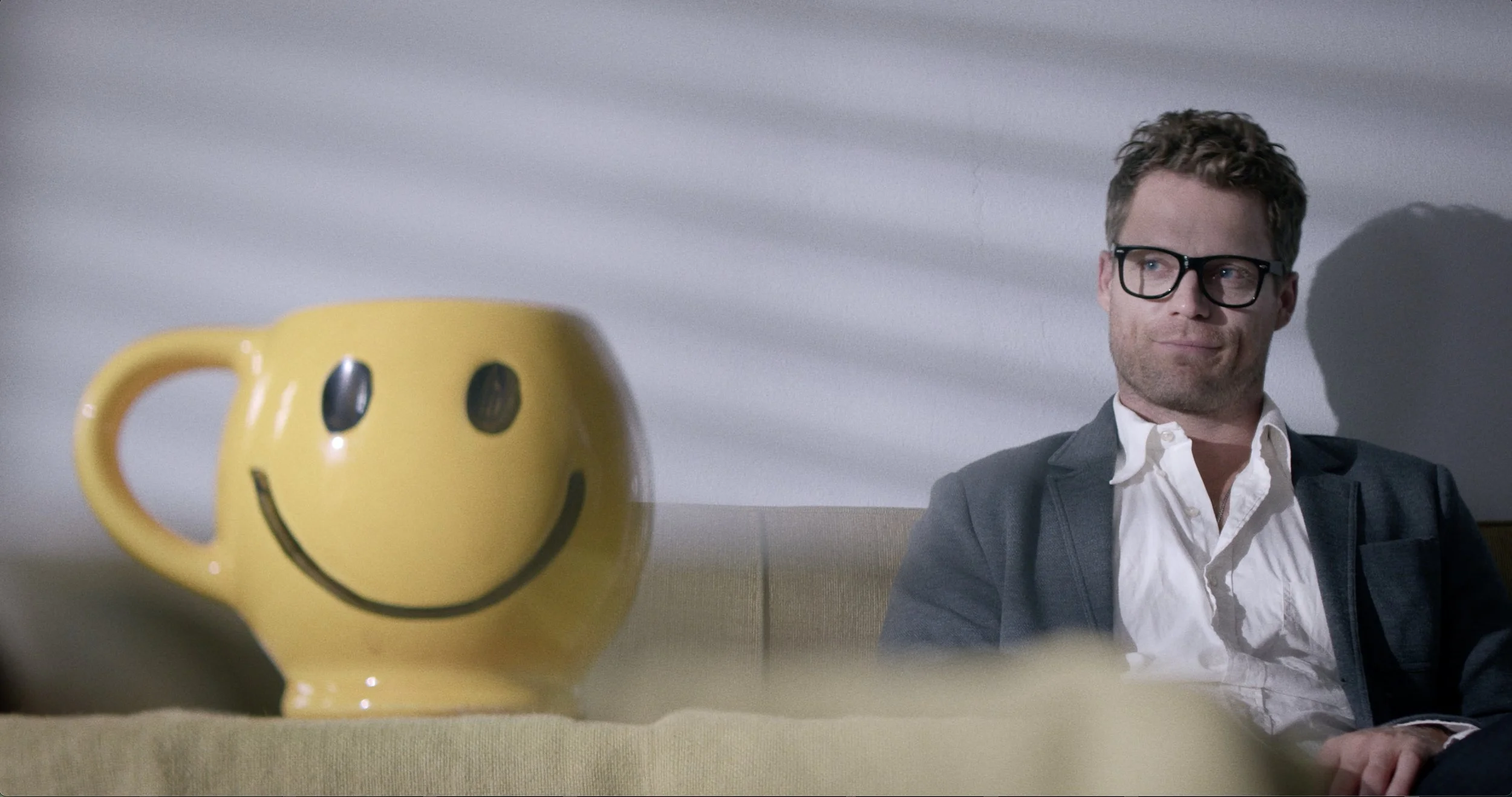
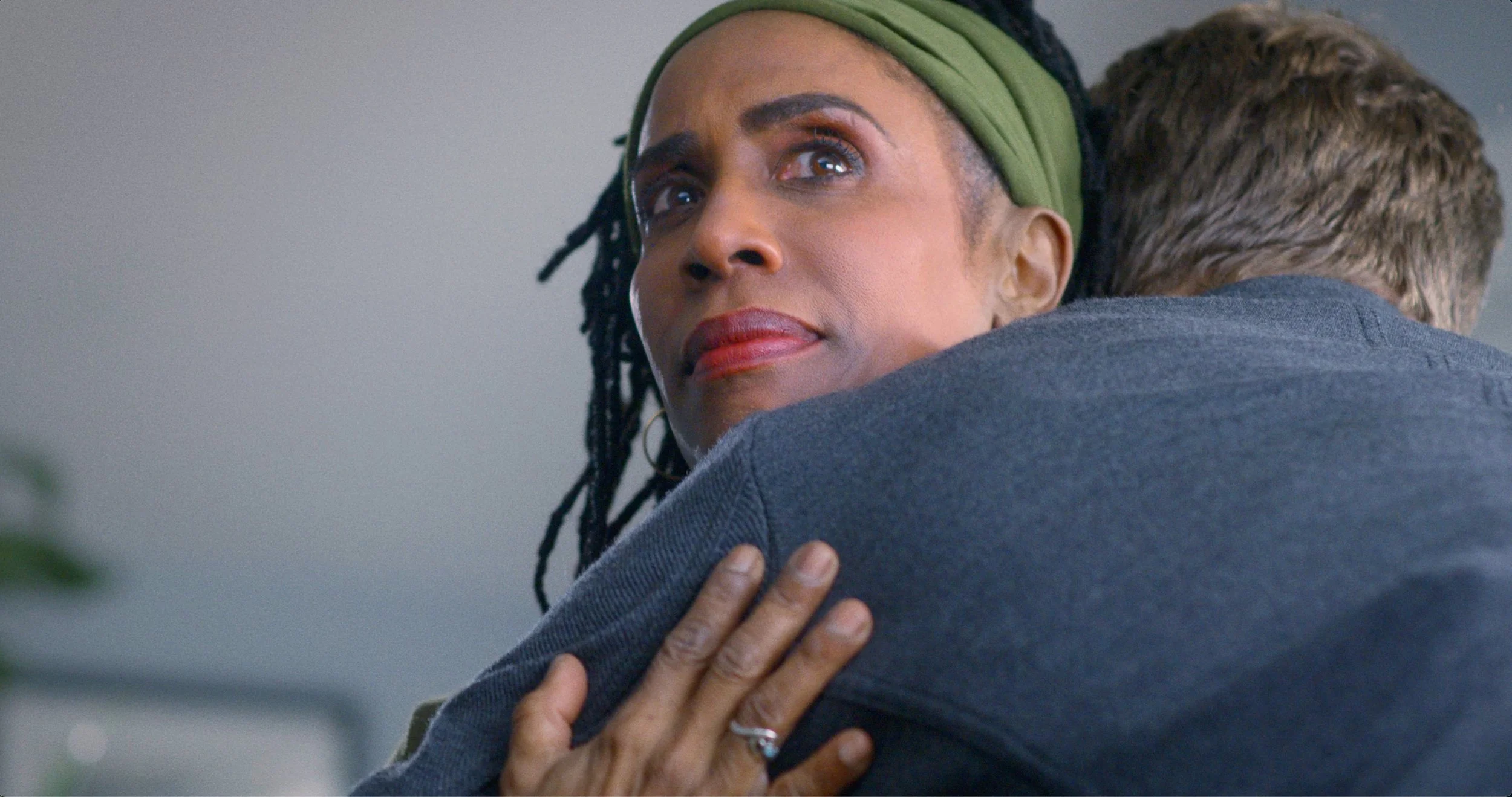
For “Help Is… on the Way?” here are three stills from the film that I believe provoke curiosity:
This still sells the piece for me. A smiley-face mug and a smirking guy. This was a shot I imagined from the get-go as I’d already had the smiley-face mug prop. It embodies the juxtaposition of the goal of therapy (the superficial - I want to be happy) with the reality of what’s really going on. It also tells you the film has a sense of humor.
This still tells you exactly what the film is. A therapy session. But the lighting is dramatic and the production design gives you an inkling of drama. This was a shot not ultimately used in the film, but, again, it tells you the story.
This is a provocative still, the look on her face tells you that, though she’s being hugged, it’s not at all comfortable. I love this shot. But of all three, it is the most oblique in terms of telling the story. It is great, however, in combination with the other stills.


